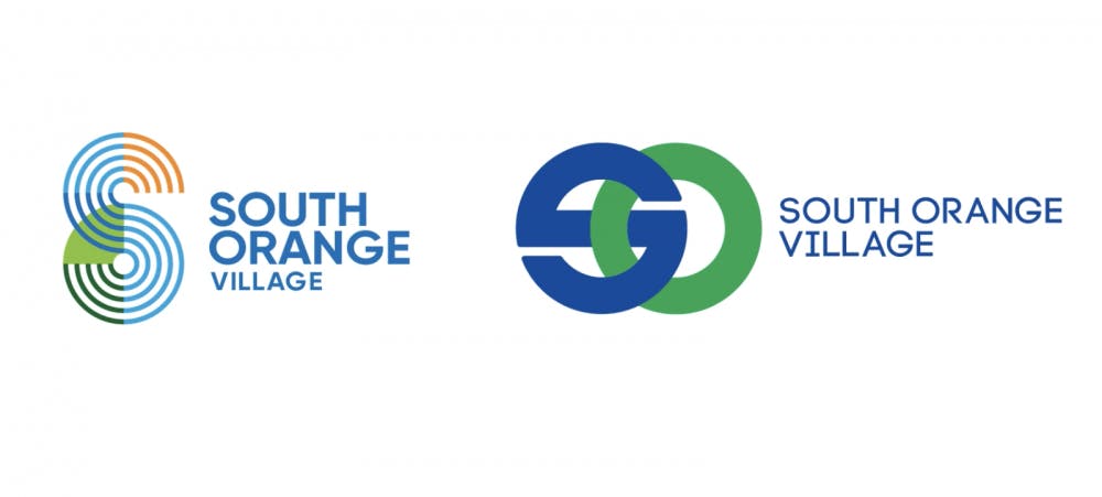
The Village of South Orange is looking for participation in a survey to help decide on a new logo for the community.
The chosen design will be featured on official South Orange documents as well as signage throughout the town.

An online survey was created by the Village government to gauge the popularity of two new logos among the community.
Stephen Schnall, a member of South Orange’s Board of Trustees, said the idea of creating a new logo was initially brainstormed when he served as chair of the board’s Public Information and Marketing Committee.
Schnall said the Village wanted to have a consistent brand identity citing the logo imagery used in different South Orange branding campaigns, including outdated logos that use the former and now privately owned site of the local government, Village Hall.
Schnall added that appealing to those contemplating moving to South Orange was a catalyst to the new logo initiative.
“There is an intention there in terms of attracting great people to come to our town,” Schnall said. “We have a particular persona around our town... A lot of people self-select to come to our community based on shared values and that was very important to us.”
Schnall said that one of the primary ways South Orange generates revenue is through tax revenue, particularly property taxes. The creation of a new logo, he said, appeals to people looking to buy homes in New Jersey, especially New York City transplants.
“[South Orange is] actually competing –– not necessarily in the way a corporation would –– but with regards to neighboring towns and regions,” Schnall said. “Why should you come to our town, Montclair, Chatham, Newark, anywhere else?”
Diane DePaolis, the designer behind the new logos, said she was chosen to create the logo designs after entering a request for proposal competition overseen by Village officials that received responses from all over the nation. DePaolis added that the new logo would be good for South Orange.
“I felt fortunate to be awarded this assignment because of my love of this town and how it welcomed me when I moved from New York,” DePaolis said.
DePaolis, who has lived in South Orange for more than 20 years, said she created the logo after carefully studying the features of the Village.
“I immediately hired a photographer, and we walked the town,” she said. “We walked from one end of the town to the other end and we took photos of every little crevice. Not just the beautiful historic buildings, but we walked and discovered bridges and bridges and hand-painted signage. I wanted to make sure that I saw everything.”
DePaolis added, “There was no one perfect iconic thing about South Orange. It was so diverse that it needed to have a vibrant dynamic mark. South Orange is dynamic. If I ask my son or my daughter what their opinion is, it’s so different from mine and that’s what we're trying to bring to life.”
Chase Cohen, sophomore diplomacy major, said she preferred option one.
“I’m excited to see which logo ends up getting picked,” Cohen said. “I love the idea of balance and interconnectivity that it presents.”
Christine Lhowe, an assistant professor of art and design, commented on the new logo designs and said she was fond of option one for “its energetic and approachable vibe” over the second because “it feels more corporate.”
Said Lhowe, "As a town with a bustling downtown and a university, the logo should be welcoming and assist in building community.”
Amanda DeJesus can be reached at amanda.dejesus@student.shu.edu


